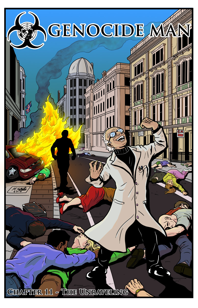
Being colorblind, this is the kind of image that gives me the shakes when I go to color it. I just know it’s too pastel and the shadows make no sense. Please at least tell me nobody’s skin is green. I tend to do that.
The good news is that this cover has convinced me to let Michael color all the chapter covers from now on. I already have the next cover and it’s terrific. But you’re going to have to wait for that. First we have this chapter where someone is becoming unraveled, and I need to show you exactly how…


There is no skin with strange color. So it is unclear what rejoices Fumiaki.
Thanks, it’s good to hear that I didn’t screw up the skin colors!
As for what’s going on with Fumiaki, you’ll find out soon.
They said I was mad! But I’ll show them. I’ll show them! I’LL SHOW THEM!
Skin and shadows look fine to me. And it’s cool that we can recognize Jacob just from his silhouette.
The unravelling – where everything goes to pieces?
Awesome cover! I have a question though: how do you actually DO the coloring? I find it incredibly difficult to understand how you manage picking appropiate colors. Anyway, keep up the excellent work, you two!
Well, I know that fire is yellow (RGB of 255,255,0) at the edges, and red (255,0,0) in the center. For flesh tones I found a guide for racial skin tones on the net, and I picked an oriental tone for Fumiaki and several other skin colors for the dead bodies. (I worry that peoples’ skin turns green or something when they die; I didn’t take that in account.) Then I arbitrarily chose colors for buildings and clothing. I had a plan for compositing, but my eyes don’t stop me from making plans. (Might make it a bad plan, of course.)
What frazzles me is I can’t make a mistake. If I accidentally make Fumiaki orange, I wouldn’t be able to tell. 🙂 And there are too many colors to go in and check when I’m all done.
Thanks for the info! That was really informative.